

Blank Resume Examples and Templates
A blank resume template can point you in the right direction and organize your thoughts if you’re creating a new resume from scratch. You can turn a blank resume into a completed one by filling…
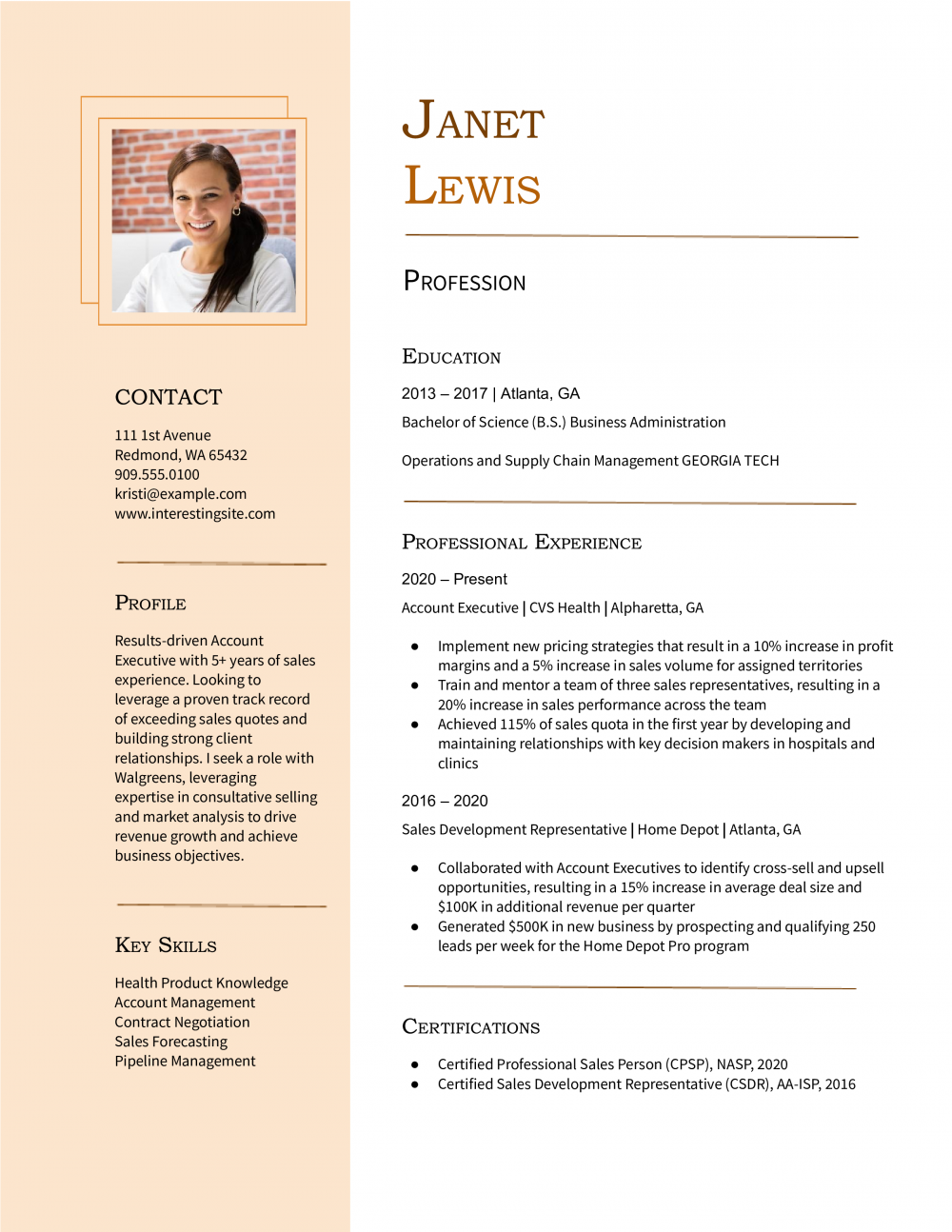
This archetype fits early-career and mid-career candidates with a focused, single-track history. The resume needs to prove relevance fast: two or three roles, bullets tied to the target job, and a skills line that surfaces the keywords an ATS will check.
Priya Achterberg
Portland, OR | (503) 555-0173 | [email protected] | linkedin.com/in/priyaachterberg
Product designer with 5 years on consumer mobile teams. Lead end-to-end work from research through handoff, with a soft spot for onboarding flows and accessibility.
Senior Product Designer
Tidemark Mobile | Portland, OR | 2022-Present
Product Designer
Fernway Apps | Vancouver, WA | 2019-2022
Start by picking the two or three roles that map most directly to the job you want. Older or off-track positions can collapse into a short “Earlier Experience” line at the bottom.
For each kept role, list only the bullets that match the target description. A bullet about a project the new employer cares about beats three bullets about routine duties.
Treat the page as a shortlist, not an archive. If a line doesn’t help the reader picture you in the new role, it loses its seat.
Pull references, hobbies that don’t connect to the work, and any “References available on request” line. Drop the objective statement and use a three-line summary instead.
Combine Education and Certifications into one block at the bottom. Most readers only need the degree, school, and any active credentials.
Roles older than about 10 years can shrink to a single line with title, employer, and dates. That keeps the timeline visible without burning space.
Set margins between 0.5 and 1 inch. Keep body text at 10.5 to 11 point, and let section headings sit at 13 to 16 point so the page still scans.
Trim line spacing to about 1.0 to 1.15, and add a small gap between sections instead of full blank lines. Keep bullets to one or two lines each.
List skills on a single row separated by commas or pipes. Reduce indents on bullets so each line reaches more of the page width.
Single-column layouts parse cleanly in most applicant tracking systems. Two-column and sidebar designs save space but can scramble the reading order during parsing.
If you want a sidebar, test it first. Export the PDF, paste the text into a plain editor, and confirm name, contact, summary, and roles still read in order.
If the parse breaks, go back to single column. Keep the skills row in the main column rather than splitting skills into a sidebar.
Read each bullet and ask whether it earns its line for this specific job. Swap weaker bullets for ones that mirror the language in the posting.
If the page only fits by shrinking below 10.5 point or removing all white space, that is a content problem. Cut a role, drop weak bullets, or move to two pages.
Save as PDF unless the posting asks for Word. Open the file on a phone to confirm the hierarchy still reads at thumb scale.
For most candidates a one-page resume is the right call: it forces you to lead with your strongest, most relevant work and respects how fast hiring teams scan. It is a layout discipline, not a demand to cut your career down to nothing.
Most resumes spill onto a second page for a few predictable reasons. Fix these and a full career fits one page without shrinking the type.
Resume Templates offers HR approved resume templates to help you create a professional resume in minutes. Choose from several template options and even pre-populate a resume from your profile.
For most candidates, yes. One page is the right call when you have under about 10 years of relevant experience, a single-track career, or you're applying online.
It forces a tight hierarchy that recruiters can scan in seconds. Move to two pages when the extra content is directly relevant, not when you're padding to fill space.
Yes. Two pages are standard once you have 10-plus years of directly relevant work, dense technical projects, or a hybrid track that needs context.
Academic CVs and federal resumes run longer by design. The rule isn't a page count, it's whether every line earns its place for the job you're targeting.
Avoid front-and-back printing. Most hiring teams scan resumes on screen, and the few who print them often miss the back side or separate the pages.
If your content needs two sides, make it a proper two-page resume with your name and "Page 2" in the header on the second page. That way the document reads correctly in both digital and printed form.
Start with the content, not the formatting. Cut older roles to one line, trim bullets that don't match the target job, and combine Education and Certifications into one block.
Then adjust layout: set margins to 0.5 to 0.75 inch, body text to 10.5 or 11 point, and line spacing to 1.0 to 1.15. Use Word's "Shrink One Page" feature only as a last check.
If the page still doesn't fit at 10.5 point with normal spacing, cut more content rather than shrink the type further.
Match the length to your career stage and the job. Students, recent grads, and most candidates with under 10 years of focused experience belong on one page.
Senior candidates with deep, relevant scope, technical specialists with project history, and anyone in academia or federal hiring should plan for two pages or more.
The test is relevance per line, not seniority for its own sake.
For a job seeker, an ATS-friendly template is the safest pick, because it puts your certifications and experience where a hiring manager scans first. A basic template is a solid alternative. Whichever you choose, keep the formatting clean and easy to parse: clear section headings, a standard font, and no graphics a parser can choke on.